Navigating MVP constraints as a Designer/PM and a retrospective overhaul of the product's design system.
Company:
HTC
Role:
UX&UI Designer
Year:
Jul 2022 -Nov 2022

The Team
1
UX&UI Designers
4
1
Quality Control

The "Real World" Challenge
The Challenge (The "Why")
The original VIVE Sync File Manager was a desktop-limited tool with three critical friction points:
🖥️ Platform Lock-in:
Only supported Windows, excluding macOS and mobile users.😶🌫️ Zero Persistence:
Files were tied to single meetings and deleted immediately after, forcing repetitive uploads.🚧 Rigid Constraints:
Supported only.pptxfiles with no clear in-app guidance on file types.
Solution - Web Basesd
As remote collaboration becomes more common, the need for simple and flexible cloud-based file sharing is growing. To support this shift, I redesigned the VIVE Sync file experience with:
🌐 Web based access:
Moving the file upload interface to the web removes OS limitations and enables file management from any platform—Windows, macOS, tablets, or mobile devices—making it more inclusive and accessible.🗄️ Account based storage system:
By shifting from meeting-specific uploads to an account-based model, users can upload their files once and access them across any VR meeting. This significantly reduces repetitive actions and supports better cross-session planning.📋 User storage plans:
Introducing tiered storage options allows users or organizations to choose plans based on their needs. This supports scalability while encouraging long-term use and content management.📄 Support for multiple file formats:
By allowing users to upload PDFs, images, videos, and 3D files directly, the new system accommodates real-world presentation workflows, increasing efficiency and creative flexibility.
This redesigned experience reduces friction, supports diverse use cases, and better aligns with the expectations of enterprise users preparing for VR collaboration.
Business Goal
Build a persistent Web Dashboard to allow users to manage files anytime, anywhere.
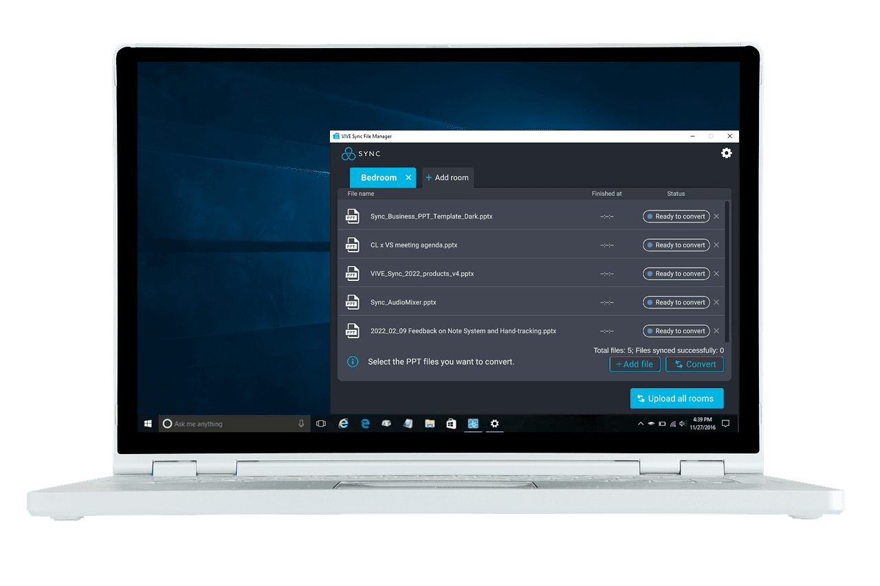
The original tool only allowed file uploads via Windows
The Strategic Hybrid Role (Designer + PM)
With a fixed launch date and no dedicated Project Manager, I took ownership of the product strategy:
✍️ Scope Definition:
Proactively collaborated with the Development Lead to define technical feasibility and project phases.🔄 Rapid Iteration:
Accelerated the delivery timeline by merging user flows and high-fidelity design into a single stage, ensuring immediate stakeholder alignment.🌟 MVP Strategy:
Successfully launched the web-based version, enabling account-based storage and multi-format support (PDF, 3D, Video) for the first time.
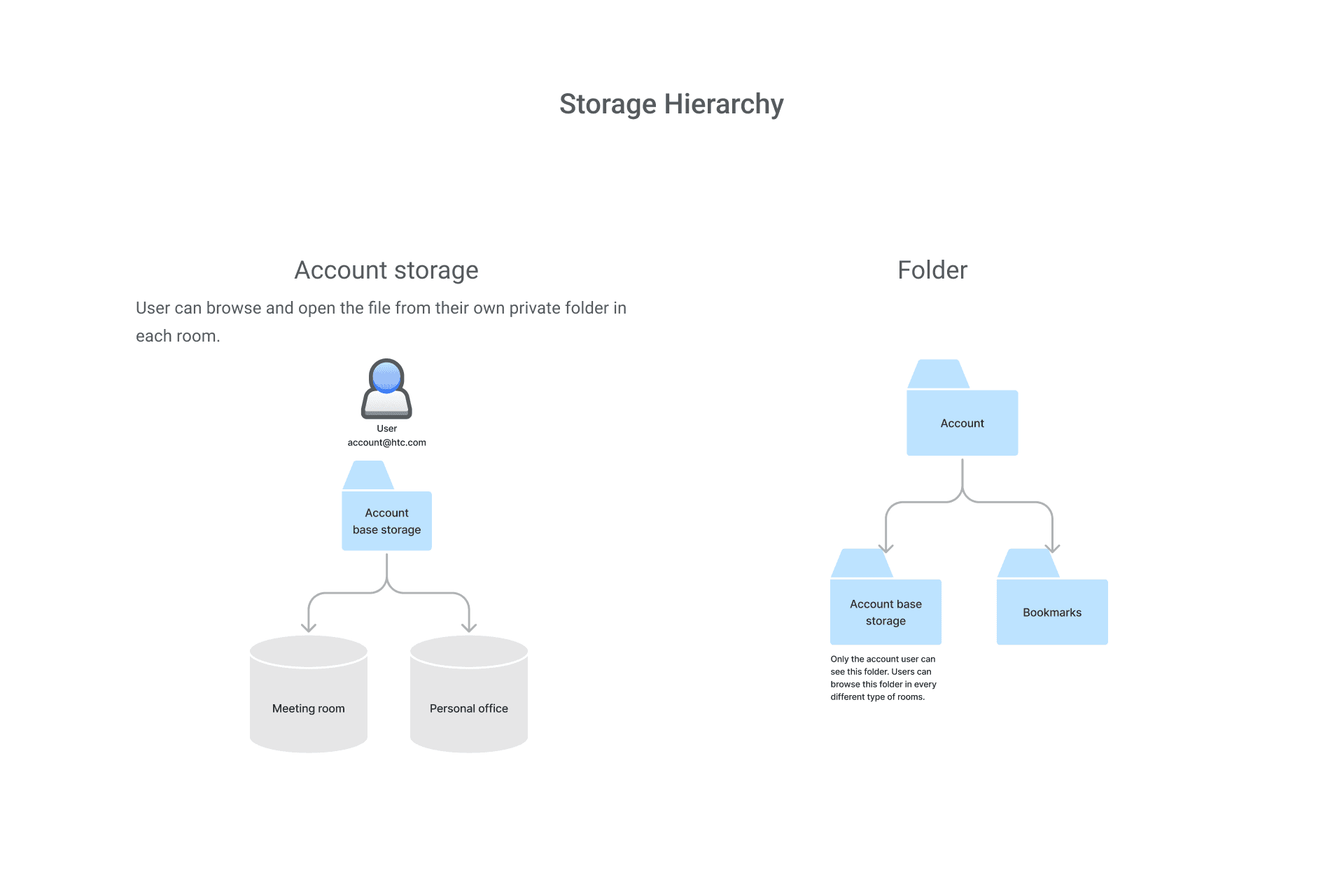
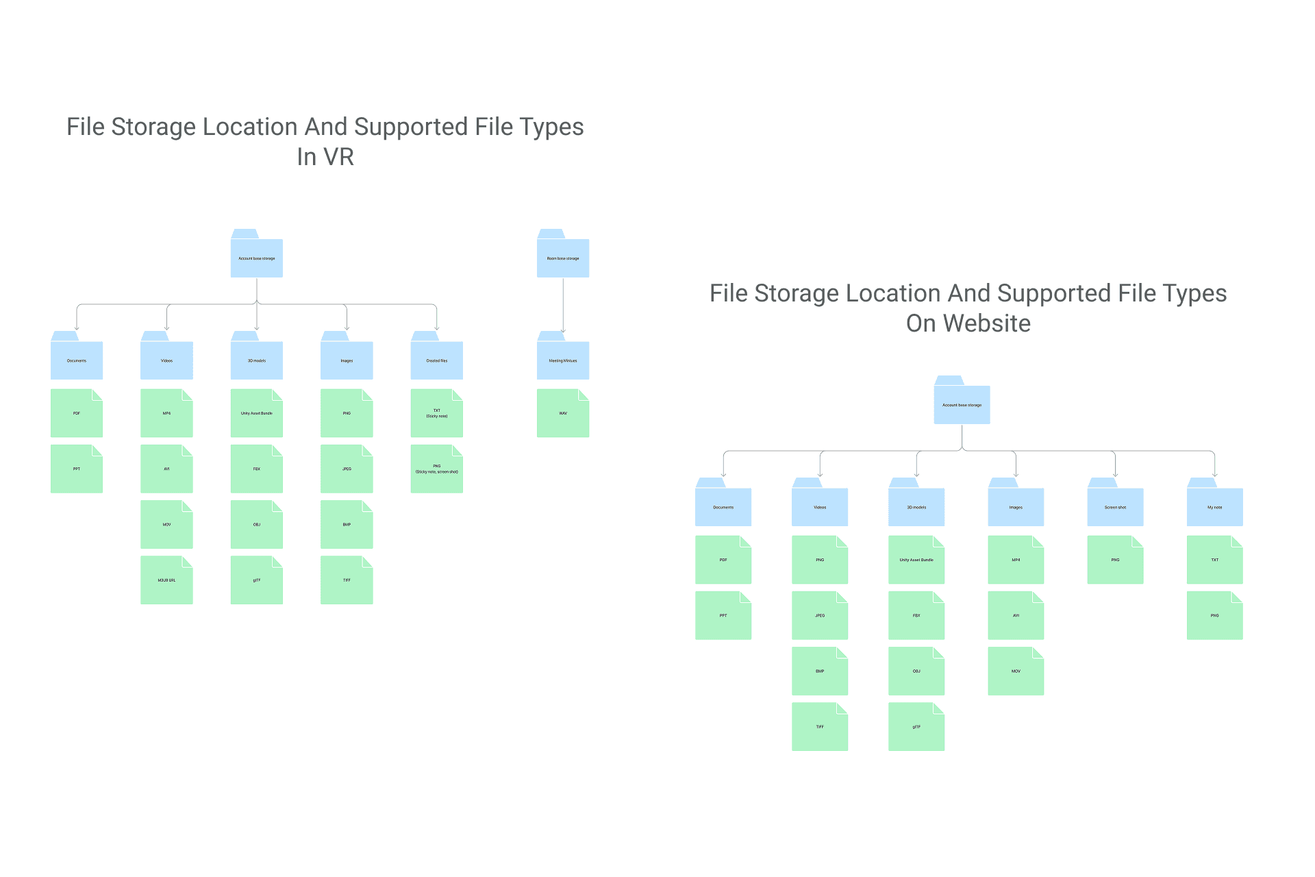
I discussed with my manager the data structure visually and clearly listed the types of files that should be displayed and used on different platforms.

The file will be automatically classified after the user uploads it. There will be a soft reminder to let the user know where the file goes.

Edit file and exceeded storage cases

UX writing for the string pattern, make sure each string as reusable as possible, and keep the copywriting clarity, consistency, and conciseness with guidance
The "UI Evolution" (The UI Redesign)
🛠️ The Self-Initiated System Overhaul
After leaving the company, I conducted a retrospective audit of the project. While the original version successfully solved the core functional problem, I wanted to apply modern design standards to create a more scalable, accessible, and polished "North Star" vision for the product.
✨ Why I Refined This Project
To transition from a "static palette" to a scalable Semantic Design System.
To optimize the UI for Global Accessibility and internationalization.
To demonstrate a Mature Product Vision unhindered by initial MVP time-constraints.
🧬 User Interface Evolution - Main Page Redesign
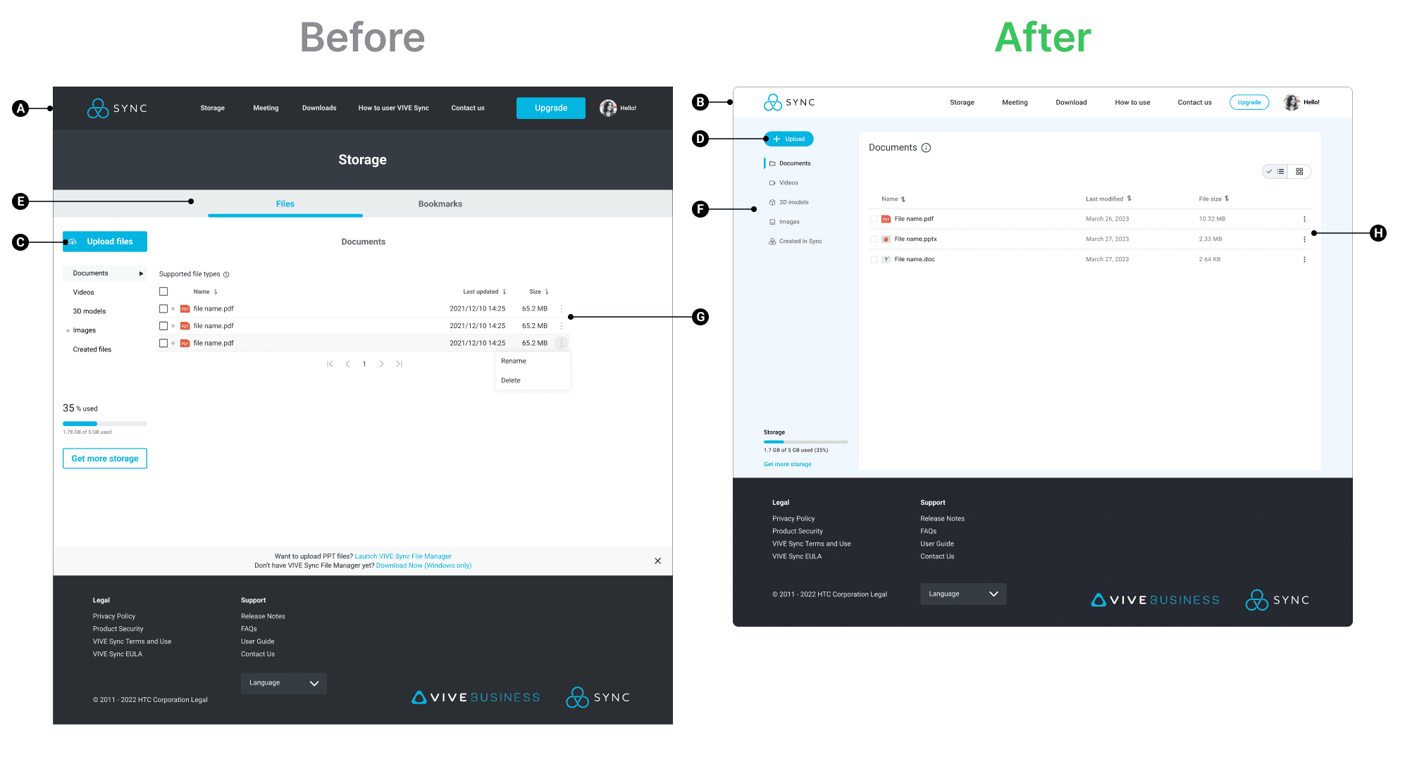
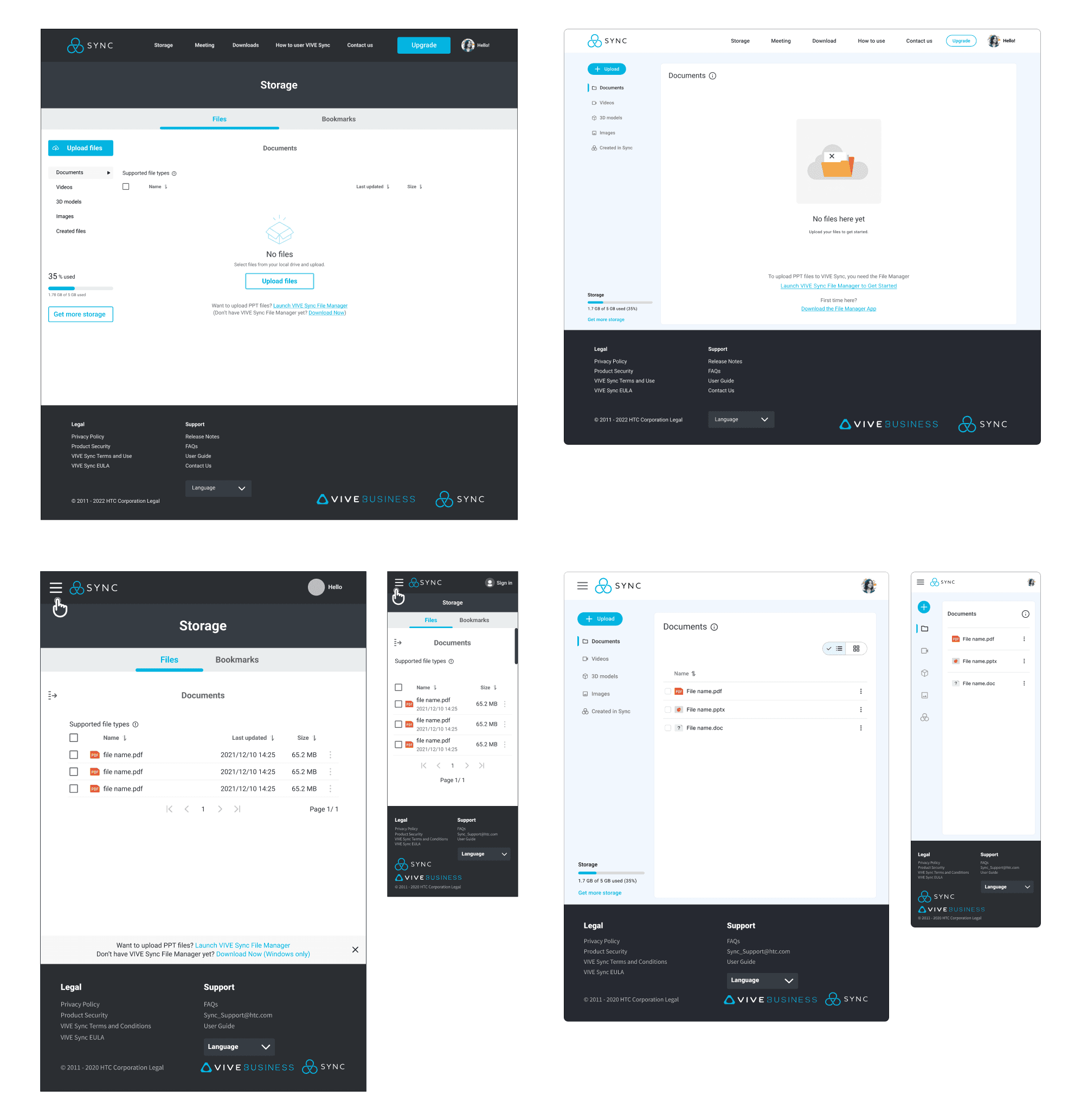
Refined Visual Hierarchy & Cognitive Load
A
B
Before
The interface utilized a heavy, dark header and high-contrast blue sub-navigation tabs that competed for the user's attention. The dark background at the top created a "top-heavy" feel that distracted from the primary content area.
After
The redesign adopts a "Clean SaaS" aesthetic with a light, airy header and ample whitespace. This shifts the user's focus entirely to the content and tasks, making the interface feel more professional and less overwhelming during long work sessions.
Strategic Call-to-Action (CTA) Placement
C
D
Before
The "Upload files" button was placed in the sidebar but shared similar visual weight with the navigation items, making the primary action less prominent.
After
The primary "Upload" button is now a high-visibility, rounded component at the top of the sidebar. This immediately directs the user to the most important action, streamlining the "Time-to-Task" metric.
Improved Information Architecture & Navigation
E
F
Before
Navigation was split between a top tab system ("Files," "Bookmarks") and a sidebar, which could confuse users about where they are in the app's hierarchy.
After
The navigation is consolidated into a cohesive sidebar that flows naturally into the main content area. The use of clear breadcrumbs and a bold "Documents" title provides immediate context, ensuring users never feel lost.
Data Clarity & Table Usability
G
H
Before
The file list used alternating grey row colors and cramped spacing, which made it difficult to scan large amounts of data quickly.
After
The redesigned table features increased row heights, subtle dividers, and clear sorting icons in the headers. This Information Density is better managed, allowing for a more comfortable and efficient reading experience.
Refining the System for Scalability & Clarity
I redesigned the color architecture into a fully documented Semantic Design System. By introducing 10-step tonal scales and functional naming conventions, I improved:
♿ Accessibility:
Ensuring WCAG-compliant contrast across all feedback states.
🚀 Efficiency:
Streamlining the handoff process by providing developers with clear usage tokens rather than hex codes.
🔗 Cohesion:
Creating a unified visual language that scales effortlessly across different platform modules.
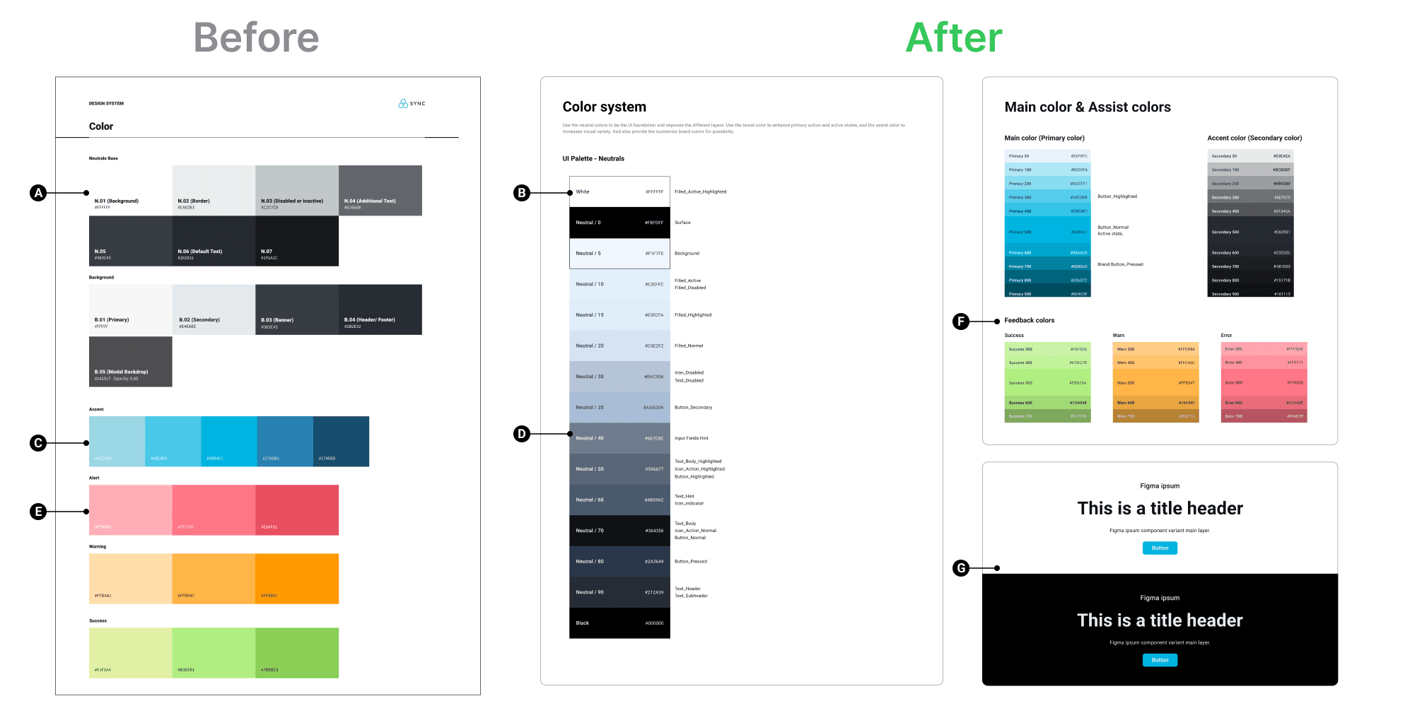
From "Colors" to a "Functional System"
A
B
Before
The colors are organized by category (Neutrals, Background, Accent) but lack clear usage guidelines. They represent a "static palette" rather than a working system.
After
I've made semantic naming (e.g., "Surface," "Filled_Active," "Text_Header"). This tells developers exactly where and how to use a color, reducing guesswork and maintaining consistency across the platform.
Scalability and Accessibility
C
D
Before
Only a few shades are provided for each color, which limits flexibility for complex UI elements like hovered, pressed, or disabled states.
After
I implemented a tonal scale (100–900) for primary and accent colors. This is a industry-standard practice (used by Material Design and Apple) that ensures you always have the right contrast for accessibility and the right depth for interactive states.
Comprehensive Feedback Logic
E
F
Before
Success, Warning, and Alert colors were single blocks of color.
After
I’ve built a Feedback System with multiple weights. This allows for nuanced UI messaging—for example, using a light green text color at dark theme to ensure high readability.
Component-Level Documentation
G
Before
There is no preview of how colors interact with typography or buttons.
After
I included Component Previews (Title headers and buttons on light/dark backgrounds). This demonstrates "System Thinking," showing that how color, type, and buttons must work together to create a cohesive user experience.
From Static Styles to a Global Typographic System
I rebuilt the typographic architecture to be responsive and region-aware. By defining a dual-typeface system and a cross-device scale, I improved:
🌏 Internationalization:
Seamlessly supporting multiple languages with Noto Sans mapping.🔁 UX Consistency:
Providing a "Usage" guide that eliminates ambiguity for developers.✨ Visual Polish:
Refining character spacing for a more professional, cohesive look across all platform modules.
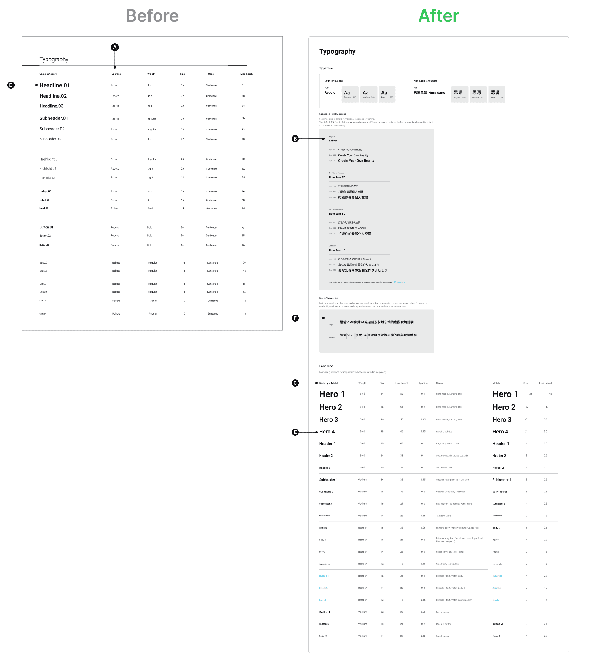
Global Scalability (Multi-Language Support)
A
B
Before
The colors are organized by category (Neutrals, Background, Accent) but lack clear usage guidelines. They represent a "static palette" rather than a working system.
After
I made a dual-font strategy, pairing Roboto with Noto Sans for non-Latin characters. By including localized font mapping for Traditional Chinese, Simplified Chinese, and Japanese, you've transformed the product into a global-ready platform that maintains visual consistency across regions.
Responsive Design Standards
C
Before
The typography existed as a single static list with fixed sizes, offering no guidance on how text should adapt to smaller screens.
After
I implemented a Responsive Font Scale, clearly defining separate values for Desktop/Tablet vs. Mobile. This ensures optimal readability and a professional user experience regardless of the user's device.
Comprehensive Hierarchy and "Usage" Logic
D
E
Before
The categories were generic (Headline, Subheader) and lacked context on where they should be applied in the interface.
After
I expanded the hierarchy to include Hero, Header, Subheader, and Body tiers with a dedicated "Usage" column. This acts as a source of truth for other designers and developers, ensuring that a "Hero 1" is always used for landing titles, thereby maintaining strict product consistency.
Attention to Micro-Typography (Detail-Oriented)
F
Before
Ignored the visual tension created when mixing different character sets.
After
I added a specific section for "Multi-Characters," adjusting the spacing between Latin and non-Latin characters to improve legibility and visual balance. This demonstrates a high level of UI craft and attention to detail that senior designers look for.
Transforming Visual Assets into a Strategic Component System
I redesigned the library into a Logic-Based Button System. By establishing clear hierarchies and technical specifications, I improved:
🔁 UX Consistency:
Defining specific use cases for sizes and styles to guide user attention.♿ Accessibility:
Ensuring all interactive elements meet industry standards for touch targets and state visibility.🚀 Handoff Efficiency:
Providing developers with a structured, documented system that reduces implementation errors.
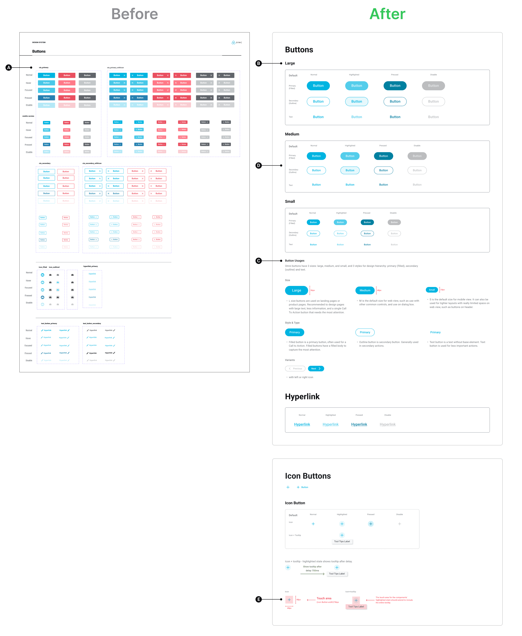
Clear Hierarchical Taxonomy
A
B
Before
The initial layout presented an overwhelming grid of color variations with little distinction between primary and utility roles.
After
I implemented a strict hierarchy based on Size (Large, Medium, Small) and Style (Primary/Filled, Secondary/Outline, and Text). This organized structure allows designers to quickly identify the correct component for any UI context.
Strategic "Usage" Documentation
C
Before
There was no guidance on when or where to use specific buttons, leading to potential inconsistency in the product.
After
I added a dedicated "Button Usages" section that provides clear UX rationale. For example, it specifies that Large buttons are for high-attention landing pages, while Medium is the default for common controls. This "source of truth" ensures a consistent user experience across the entire platform.
Defined Interaction States
D
Before
While states existed, they were cramped and difficult to distinguish at a glance.
After
Every variation now features clearly defined, high-contrast states for Default, Highlighted, Pressed, and Disable. This improves accessibility and provides developers with unambiguous visual cues for implementation.
Technical Precision & Accessibility
E
Before
The documentation lacked specific measurements for development handoff.
After
I introduced a section for Icon Buttons that explicitly defines the 48px touch area. This demonstrates a mature understanding of mobile accessibility standards and ensures the UI is usable for all input methods.
Key takeaways
The Evolution from Execution to Systems Thinking This project represents my ability to deliver under pressure while maintaining a commitment to long-term design excellence.
👔 Agile Leadership & Ownership:
Acting as a hybrid PM/Designer during the official project taught me how to negotiate scope and prioritize features. I learned to drive product clarity and align technical feasibility with user needs to meet a hard launch date.📈 The Value of Retrospective Growth:
Revisiting this project after leaving the company allowed me to look at the work with fresh eyes. This self-initiated refinement proves my commitment to continuous improvement and my ability to identify "Design Debt" that often occurs during fast-paced MVP cycles.💪 Mastery of Scalable Foundations:
Building the refined design system taught me that true UI/UX value lies in the architecture. Moving from a simple UI to a semantic, responsive system demonstrates my ability to build products that can scale from 10 to 1,000 screens without breaking.🌏 Global Empathy & Detail:
My work on the refined typographic system—specifically on the localization and character spacing—highlights my attention to detail. It reflects my belief that professional enterprise software should feel inclusive and native to every user, regardless of region.